
How to read the trend charts
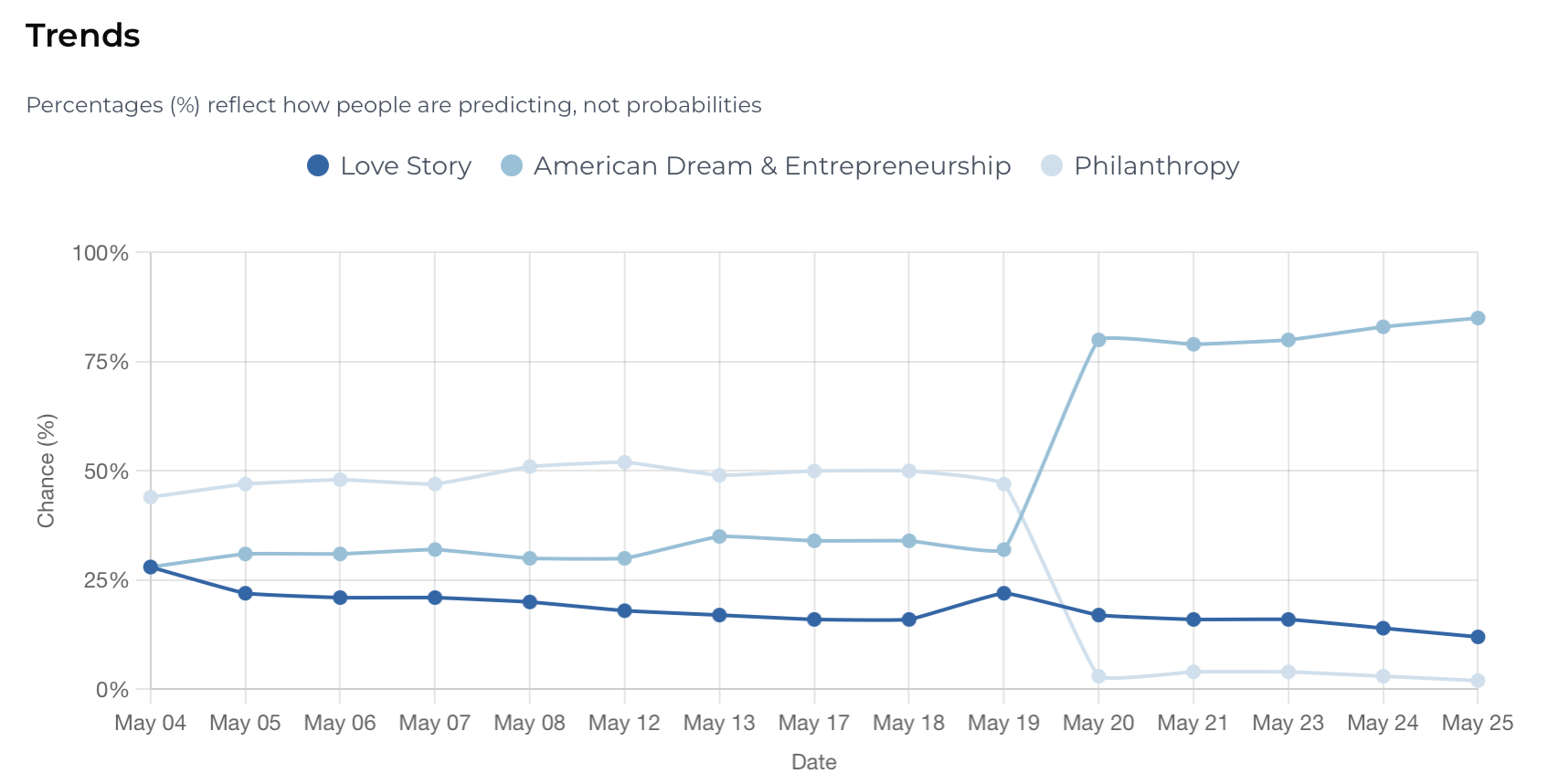
Every Market Question on Story Inc. includes a Trends chart — a live view of how fan sentiment is shifting over time.
Here's how to read it and use it to make smarter predictions.
What the percentages mean
The percentages on the chart reflect how fans are predicting — not the probability of an outcome actually happening. If 80% of fans have predicted "American Dream & Entrepreneurship," it means 80% of predictors chose that option, not that it has an 80% chance of being correct.
This is an important distinction. A market can be heavily weighted toward one outcome and still resolve differently — which is exactly where opportunity lies for a sharp predictor.
What the chart is showing you
Each line represents one of the possible outcomes for that market. As more fans make predictions, the lines shift to reflect the current distribution of sentiment across all predictors.
You can filter the chart by time window — 1D, 1W, 1M, or All — to see how sentiment has evolved over different periods.
How to use it
A stable chart with little movement suggests strong consensus — most fans agree on the likely outcome. A chart with sharp movement or a recent spike signals that something may have shifted — news, an announcement, or a surge of new predictors.
Use the chart to decide:
Buy more contracts — if you believe the market is moving in your favor and want to strengthen your position before it closes
Hold — if sentiment confirms your prediction and the market looks stable
Sell early — if sentiment has shifted against your prediction and you want to lock in a partial return before the market resolves
A small 0.1% trading fee applies when buying or selling.
Updated May 29, 2026